Real-time material consumption reporting for factory operators — designed to work in gloves, in noise, in motion. No desktop required.
Timeline
3 Months
Role
UX Designer (Co-Lead)
Tools
Figma
Company
Oracle SCM Smart Operations
01 — The Problem
Tethered to the Desk
First, a quick primer
A few shop-floor terms in plain English — skip ahead if you know the domain.
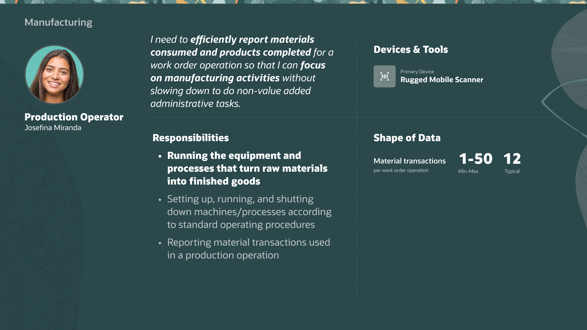
Production Operator
The factory-floor worker who runs equipment and reports the materials used in each production step — the primary user of this feature.
Report Materials
Logging which materials, and how much, were consumed to build a product — the core transaction this app handles.
Issue / Return
Issuing pulls materials from inventory into a work order; returning sends unused materials back.
LPN (License Plate Number)
A barcode that identifies a specific container or pallet, so a whole unit of material can be tracked with a single scan.
Serial Number
A unique ID for an individual tracked item — versus a lot, which tracks a whole batch together.
Oracle's Operator Workbench (OWB) is a comprehensive desktop application that lets operators report operation completions, issue and return materials, and report scrap. Powerful — but entirely stationary.
This created a real business gap: a growing share of manufacturers now run production reporting on handheld devices, yet OWB kept operators tethered — commuting to terminals between every task and adding latency to the production record.
Production Operator persona — responsible for running equipment and reporting material transactions.
Rooted in real customer pain points
This wasn't a technology-led feature — it's grounded in observed shop-floor conditions:
"In manufacturing environments with fast-paced operations where multiple components are used in an operation, it is common to use industrial handheld mobile devices to report production activities."
Oracle Readiness documentation · Mobile Material Issue & Return
The Goal
Empower factory operators to report material consumption in real-time at the point of work — eliminating the "commute" to a stationary desktop terminal entirely.
The Existing Desktop Experience
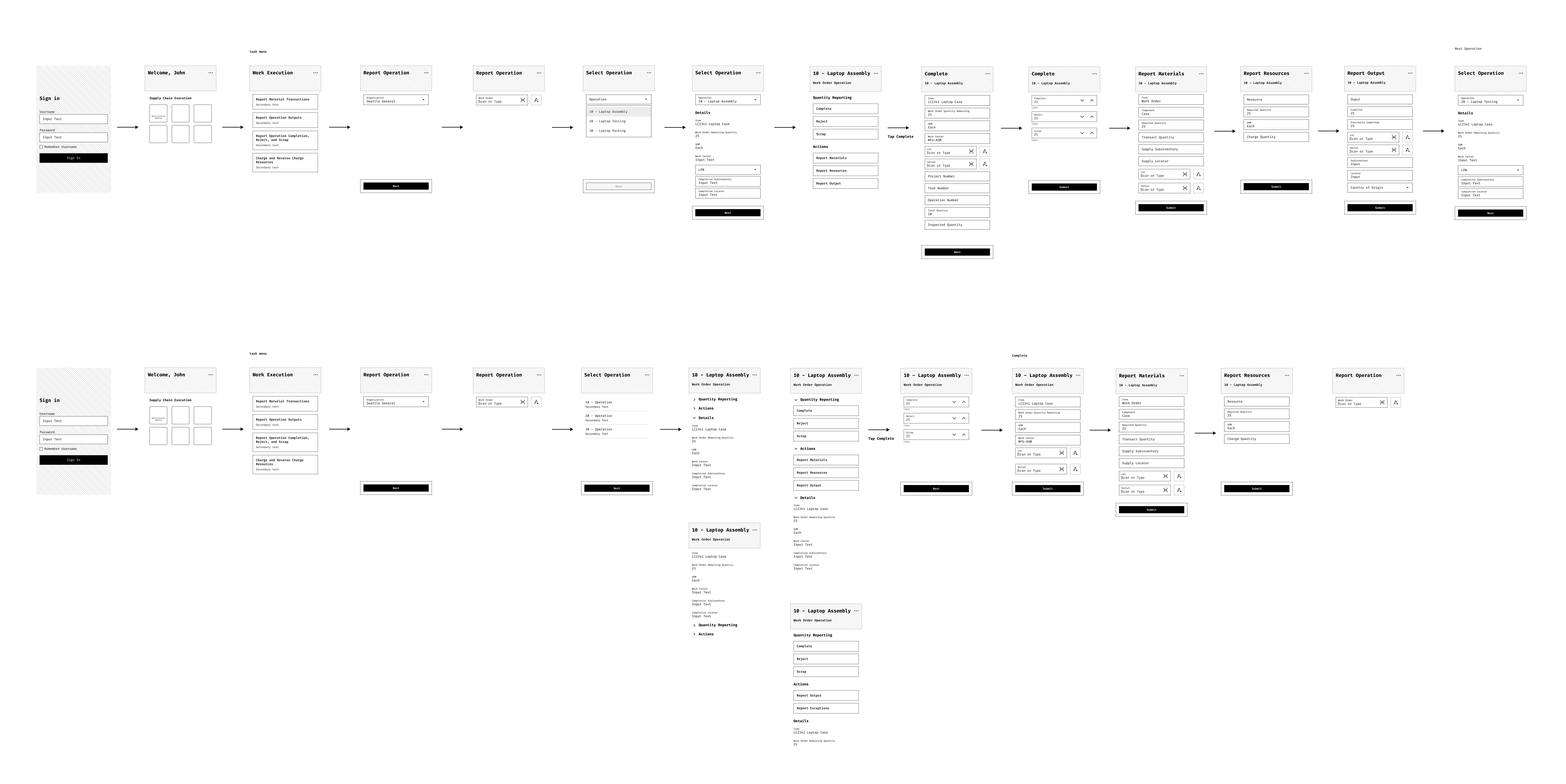
Operator Workbench: Report Materials Flow
Step 1 — Work Order Context
Operator navigates to a work order and reviews details before initiating material reporting.
Step 2 — Report Materials
A dense data-entry form with multiple fields — designed for a mouse, keyboard, and large monitor.
Step 3 — Component Details
Lot, Serial, and LPN fields all visible simultaneously — information overload on a small screen.
Step 4 — Submit Transaction
Confirmation and submission — a multi-step process that keeps operators away from the assembly line.
02 — The Conflict
Navigating the Ambiguity
The most significant challenge wasn't the UI — it was alignment. Three compounding obstacles threatened to derail the project before design could begin.
1
The Documentation ParadoxNo standard requirements doc existed — just fragmented bullets and massive Excel spreadsheets whose nested logic often contradicted itself.
2
The Timezone GapThe PM team (India) and UX team (PST) shared a single 1-hour sync window each morning — any unanswered question stalled the project for a day.
3
The "Stop-the-Line" InterventionWhen lo-fi wireframes were rejected for missing unwritten requirements, we escalated — forcing an alignment meeting to lock a single source of truth and walk OWB's business logic live.
Initial lo-fi wireframes built from fragmented documentation — rejected for not matching unwritten requirements.
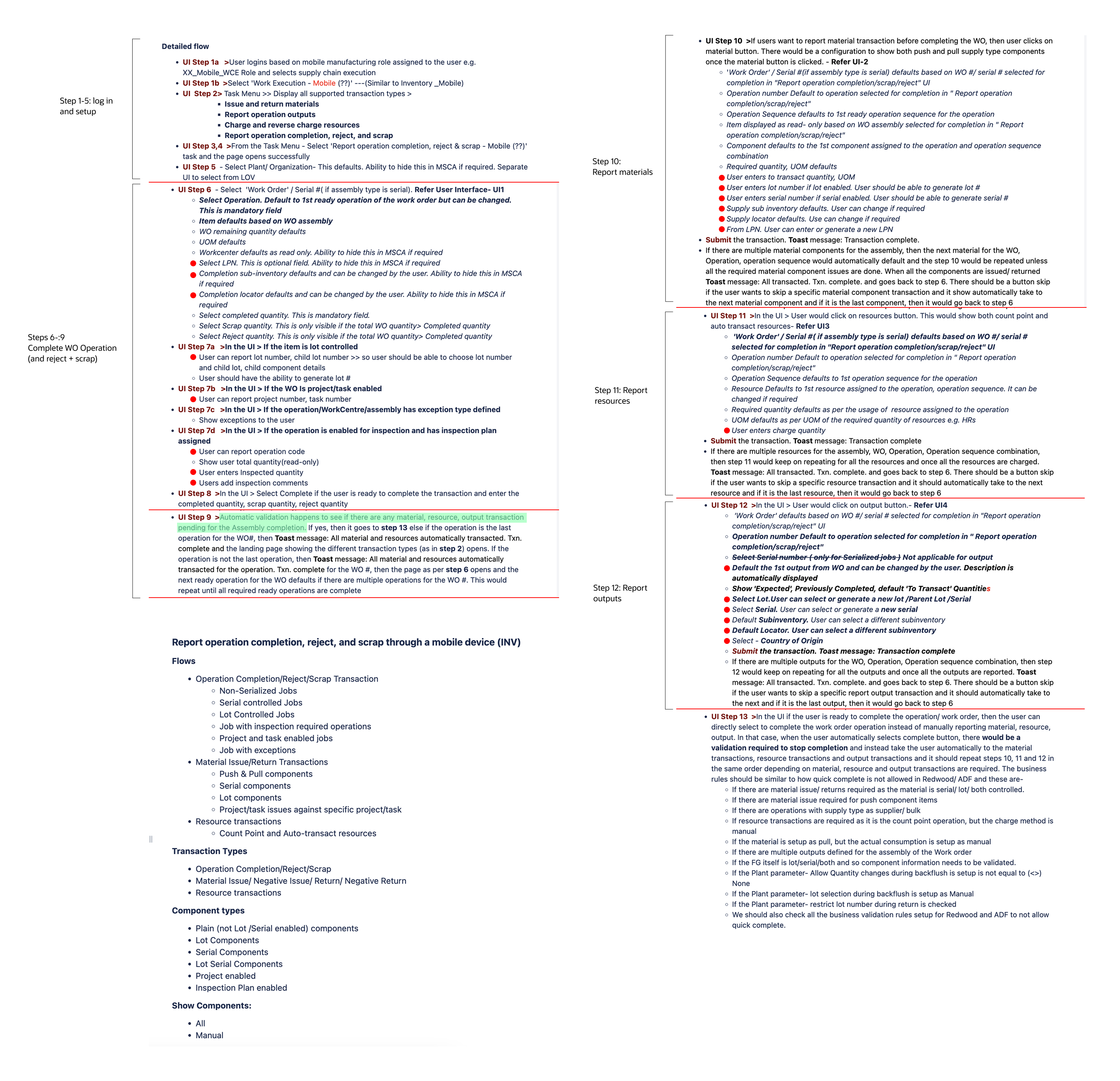
An example of the fragmented requirements docs — dense, nested logic that often contradicted other docs.
03 — The Pivot
It's Not a Smartphone
Three weeks in, a review with the VP of Manufacturing Engineering revealed a massive oversight. The initial assumption: "mobile" meant a smartphone interface.
This was wrong.
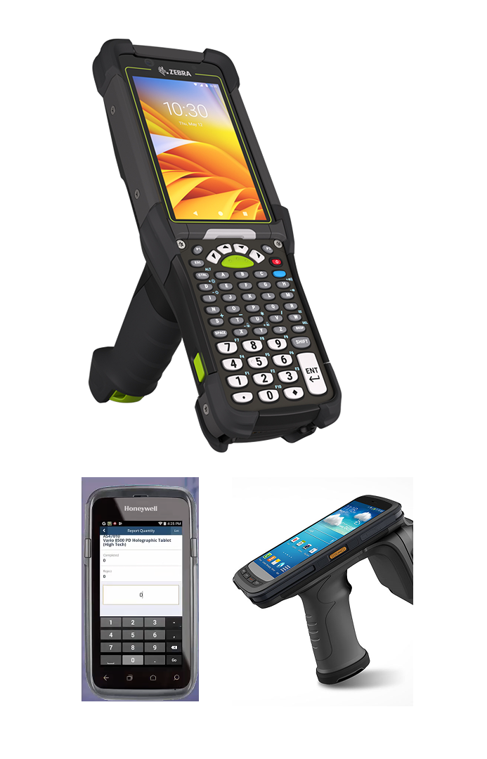
Users weren't using iPhones — they were using rugged barcode scanners (Zebra/Honeywell). Bulky, industrial devices with small screens and physical keypads. The frame needed to be wider and shorter. And this wasn't a mobile view of OWB — it was a standalone application launched from the Oracle Fusion page.
The Discovery
This single insight shifted the entire UX philosophy — from "responsive web" to "industrial-first native app." Every design decision that followed was filtered through one question: does this work in a factory, with gloves, in low light, under noise?
The actual hardware: Zebra and Honeywell rugged scanners with physical keypads and small screens.
04 — Design Principles
Industrial-First Thinking
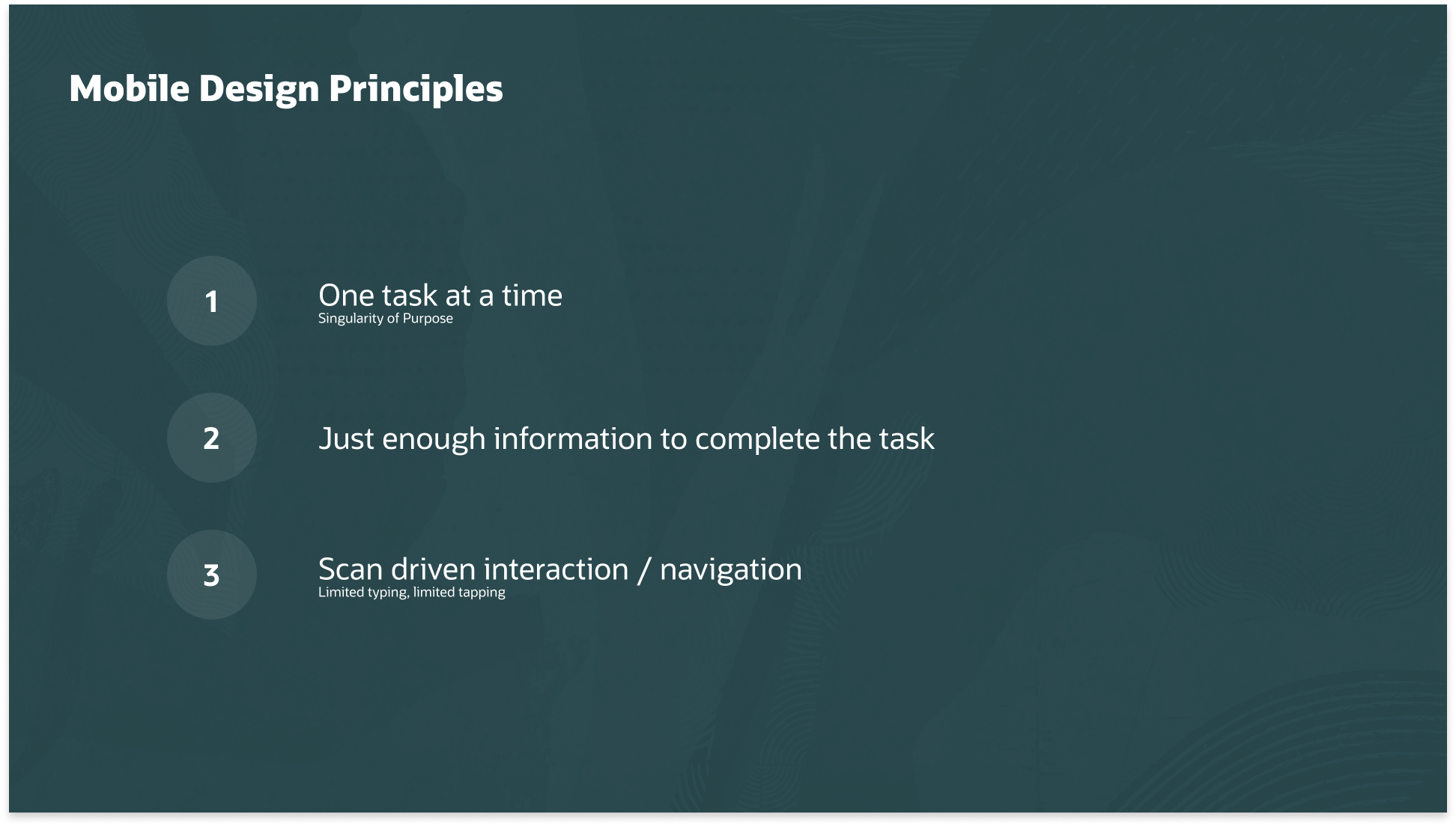
Initial "mobile site" mocks were abandoned in favor of three principles shaped by the physical environment — gloves, loud noise, motion, low light.
01
Singularity of Purpose
Operators work in high-stress environments. The UI focuses on a single active task at a time — no clutter, no unnecessary navigation — to reduce decision fatigue.
02
Progressive Disclosure
Rugged scanners have limited screen real estate. Instead of showing all input fields at once, the system detects what each material requires and reveals only those specific fields.
03
Scan-Driven Navigation
Tapping a screen with gloves is difficult. The hardware's built-in scanner drives the UI — scanning a material automatically selects it and triggers the next logical input field.
05 — Component Exploration
The Anatomy of a Scannable List
Multiple iterations of the Redwood List Item component were explored to find the right balance between data density and instant glanceability on a small screen.
Early exploration — all fields visible simultaneously, overwhelming on small screens.
Tabbed To Report / Completed split — better task separation but added navigation overhead.
Progressive disclosure approach — fields appear contextually as the operator scans.
Final anatomy of the scannable list item — three annotated zones for primary ID, status, and quick actions.
Hierarchy of Information
Primary line: Material Number — what operators look for first.
Secondary line: Quantity + Unit of Measure — how much is needed, no extra tap.
Status as Visual Shorthand
Pending (grey): still to do. Ready (green): all data captured — serial, lot, LPN.
Operators can scan a long list and see what remains at a glance.
06 — The Solution
A Scannable, Reactive UI
The Redwood Design System was leveraged to create a high-density, efficient reporting experience. The happy path is entirely scan-driven — operators rarely need to type a single character.
The happy path running on the actual hardware — a Zebra rugged scanner, scan field in focus and ready.
State 1 — Pre-issued materials with status badges.
01
The Intelligent List
Pre-issued materials are displayed with clear Ready vs. Pending status badges for quick scanning in low-light factory environments. The material scan field is in immediate focus — no extra taps to begin.
State 2 — Scanning reveals only that material's required fields.
02
Scan-to-Reveal Logic
Once the operator scans a material barcode, the system detects what that specific material requires — Lot, Serial, LPN — and surfaces only those fields. No decision fatigue, no blank fields to ignore.
State 3 — All fields filled; badge flips to Ready and Submit activates.
03
Progressive Completion
As each material is scanned and its fields completed, the badge changes from Pending to Ready. The Submit button activates only when every material is accounted for — a built-in quality gate.
The Detail Drawer — a full-screen editor for split quantities and locator edits.
04
The Detail Drawer
The primary "Happy Path" stays lean and scan-driven. For rare cases — like splitting quantities or editing locators — a full-screen drawer provides a complete editing surface without cluttering the main list. Complex tasks accessible but out of the way.
Final Issue Material UI — the complete scanning flow from list to submission.
Stakeholder Reaction · Lead Manufacturing Engineer
"The proactive field injection is a game-changer. We won't have to train operators on which materials require a Lot vs. a Serial number — the UI just tells them what to do next."
07 — Additional Flows
Beyond the Happy Path
The core scanning flow handles the majority of transactions — but one more flow rounds out the full operator experience: issuing materials that aren't pre-listed on the work order.
Ad-hoc Material Issue — issuing materials not pre-listed on the work order, including split quantity and LPN capture.
08 — Impact
Changing how the work gets done
The point was never a nicer screen — it was moving production reporting off the shared desktop and onto the floor, at the moment work actually happens. Concretely, the design shifts:
Where it's reported — desk → point of work
Operators report from a rugged handheld at the assembly station instead of walking to a shared desktop terminal between tasks.
Getting the work order in — typing → scanning
Manually keyed work-order and material numbers give way to barcode scanning, which drives the UI and selects the next field automatically.
When the record is created — batched → real-time
Transactions are logged as work happens rather than delayed and batch-entered later, so exceptions can surface at the station, not hours afterward.
Devices supported — desktop-only → industrial handhelds
Reporting extends from the desktop-only Operator Workbench to Zebra/Honeywell rugged scanners built for gloves, low light, and noise.
Part of a bigger shift
The Material Issue flow shown here is one piece of a broader Oracle move to the floor: the Redwood Production Reporting release brought barcode-enabled mobile support to six core transaction types — Material Issue, Material Return, Operation Completion, Scrap, Rejects, and Product Outputs — replacing paper forms, fixed workstations, and delayed entry with point-of-work reporting.
09 — Reflection
What I Learned
A project that tested not just design craft but alignment, communication, and the willingness to challenge assumptions — even three weeks in.
01
Design as Diplomacy
The most important tool isn't always Figma — sometimes it's a shared spreadsheet and a "Stop-the-Line" meeting that unblocks the whole project. Communication is a design skill.
02
Hardware Dictates Software
Designing for a rugged scanner is nothing like designing for a smartphone. Understand the physical environment — gloves, low light, noise — before committing to any UI pattern.
03
The Power of Constraints
The tiny screens made the product better — forcing us to cut "nice-to-haves" for "must-haves," resulting in a cleaner, faster experience than the desktop OWB.
04
Know Your User's World
The VP review that surfaced the scanner hardware was humbling. Assumptions about the user's physical world — device, lighting, gear — matter as much as assumptions about their mental model.
10 — What's Next
Validation & What I'd Measure
The impact above describes what the design changes about the workflow — not measured field results. The honest gap in this project: as an enterprise feature handed to engineering, I never had direct access to the factory floor to test with real operators before handoff. That's the first thing I'd close — and I'd hold the design to measurable outcomes, not assertions.
Testing with real operators
A moderated usability test on real Zebra/Honeywell hardware — gloves on, low light, noise. The core question: can an untrained operator complete a report without help?
Task success rate — share of operators completing a report unaided
Time-on-task — measured against the desktop OWB baseline
Glove & low-light usability of scan focus and tap targets
Metrics I'd track in production
Once live, the design's value should show up in the production record itself — measured against the stationary desktop flow it replaced.
Transaction completion time — to confirm the projected ~50% cut holds at scale
Point-of-work rate — % of transactions logged at the line vs. a desktop terminal
Real-time exception catch rate — errors caught at the station vs. hours later