An asynchronous iOS concept built around a rotating judge, a weekly creative challenge, and a loop designed to keep friends close long after the novelty wears off.
Timeline
2026 · In Progress
Role
Product Designer (Solo)
Platform
iOS Mobile App Concept
Tools
Figma · Claude · Claude Design · ChatGPT · Gemini Images
01 — Overview
When Friend Groups Drift Apart
As young adults leave college or relocate for work, close friend groups fragment across time zones, careers, and life stages. Messaging apps and social feeds keep us updated on the big milestones, but they fail to maintain everyday closeness. Relationships don't fade because people stop caring — they fade because they lose the spontaneous, organic triggers to do things together.
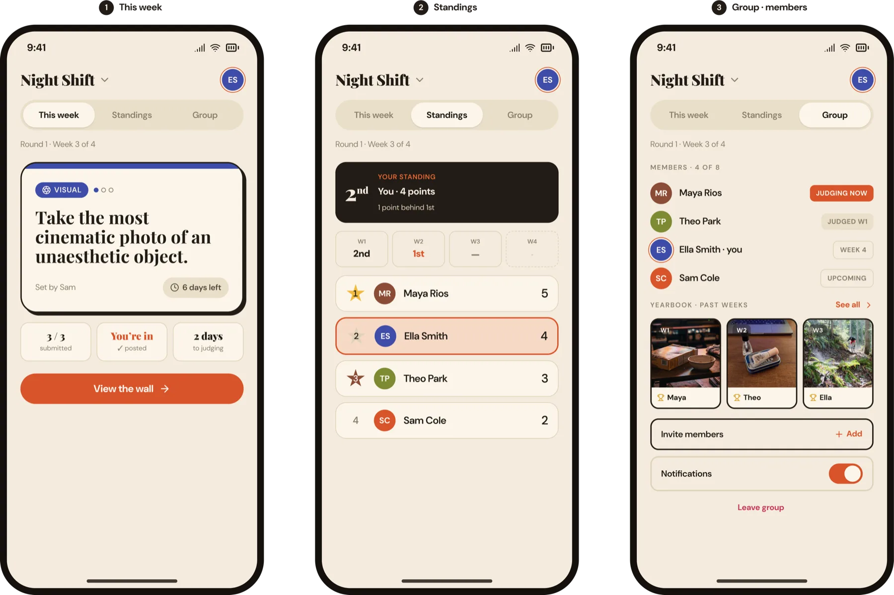
SideQuest turns a fading group chat into a structured weekly ritual. Inspired by the British comedy game show Taskmaster, each week a rotating judge sets a creative, low-stakes challenge. Friends submit a photo or video, the judge ranks them, and points stack across a single round before resetting — a fresh start, every week.
02 — Final Designs
Every Flow Serves One Goal
Not one screen in the prototype is a feature for its own sake. Each traces back to the single job the product exists to do: keep a scattered group genuinely close, week after week. Groups don't fade because people stop caring — they fade because there's nothing to do together. Walk through the core flows below, end to end — each one a connected prototype, with the design decisions that earn its place against that goal.
01
Get a Scattered Group Started
The real cold start isn't one user — it's a whole group. Onboarding starts the first week at three with a one-tap re-nudge for stragglers, deep-links invites straight past the sign-up cliff, and routes each member by how many groups they're in — the fixes for the cold-start gaps from testing, now in motion.
02
The Judge Sets the Challenge
Each week the role rotates to a new judge, who picks from a curated bank of five prompts — six categories, 1–3 effort dots — or writes a custom 120-character challenge, then locks it. A 24-hour clock, with a group-vote fallback, closes the judge bottleneck testing surfaced, so the week always starts on time no matter who's busy.
03
Submit, Then See
The engagement engine, live. The submit-to-see wall keeps every entry blurred until you post your own — then opens into the private social space, with full-screen reactions, threaded comments, and the one-tap "I'm here" path for a busy week. Anticipation, participation, and banter in a single move.
04
The Judge Ranks & Reveals
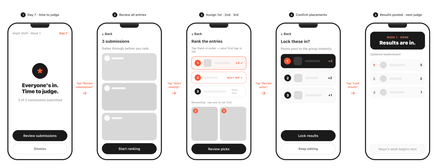
On the synchronized reveal night, the judge reviews each entry full-screen, ranks them 1–2–3, and posts. There's deliberately no "best" or "loser" — every active player earns at least a point, so the week reads as a collective effort, and the results land with their own thread for the gloating and recount demands.
05
The Yearbook
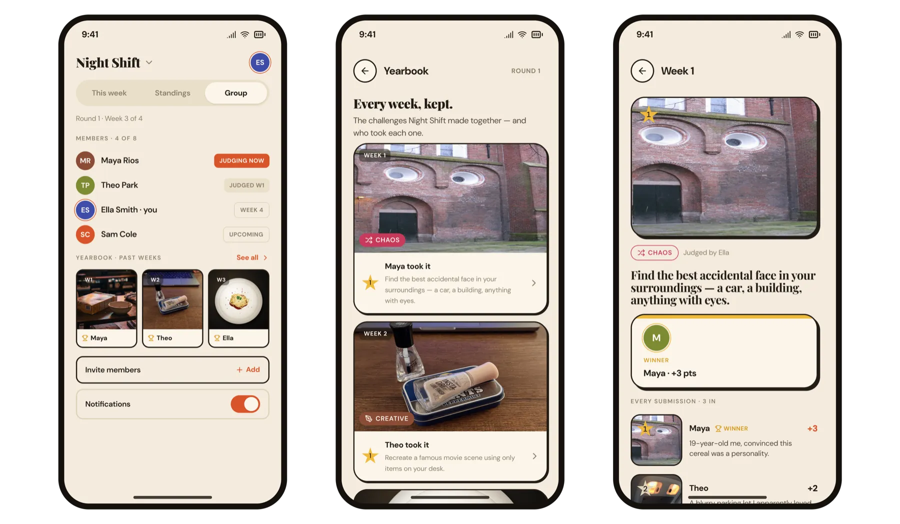
The looking-back layer from the iteration phase, in the Group tab: a scrollable archive of every past week — challenge, winning entry, full ranking — that reopens as a complete time capsule of entries, captions, and comment threads. Standings reset each round, but the memories stay.
The Through-Line
Every flow is in service of one thing: giving a scattered group a reason to show up for each other — and making sure no gap (a slow judge, a quiet midweek, a busy friend) is ever allowed to break the habit.
Supporting Screens & Edge Cases
A few stationary flows that keep the core loop legible and handle the real-world states a scattered group actually runs into.
In-Group Tabs
Three fixed tabs keep the whole loop one tap apart: This Week (active challenge + submission), Standings (the round leaderboard), and Group (members, settings, and the Yearbook).
Adaptive Landing
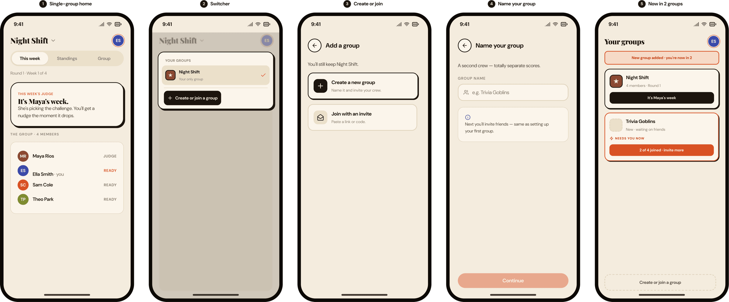
The open screen routes by how many groups you're in, so no one hits a cold dashboard: zero → create or join; one → straight in; two or more → a dashboard that flags the group that needs you now.
Adding a New Group
Real life means more than one circle. From the switcher you can spin up or join another group via the same two-minute path — without turning home into an endless feed that dilutes the one that matters.
03 — User Research
Talking to Scattered Friends
SideQuest is about a problem I'm living, so I took it to the people living it. I ran 18 generative interviews with peers aged 22–30 — friends now scattered across six cities, a mix of genders, and every kind of post-grad life stage: some in grad school, some in med or law school, others working full-time across different industries. Same open-ended guide each time, then I coded the transcripts for patterns. The goal: stress-test my core assumptions and find the real design problem before drawing a single screen.
Interviews
18
Peers, ages 22–30, 6 cities
Would try it
16/18
The 2 holdouts were a fit issue, not the concept
Top fear
Drop-off
Named by 14 of 18
Biggest unlock
Triggers
Groups need a reason to reach out
Who We're Designing For
Synthesizing the eighteen interviews surfaced two archetypes the product has to serve — and the tension between them shaped the core mechanic.
SC
The Scattered Connector
Primary · the pattern in most interviews
A few years out of college, their once-tight group is now spread across cities. They're usually the one trying to keep everyone together — and quietly worried the group is slipping away.
Goal
A low-effort, recurring reason to stay close — without always being the one who has to organize it.
Frustration
The chat only reacts when something happens. The social load falls on them, and vague plans rarely land.
RC
The Reluctant Competitor
Secondary · the non-competitive minority (≈4 of 18)
Part of a small, creative, emotionally close group. They cherish shared moments but find ranking and winning-or-losing more threatening than fun.
Goal
Shared rituals and inside jokes — the togetherness, minus the pressure of competing.
Frustration
Leaderboard-driven apps feel alienating and performative — so the product needs a genuinely low-stakes mode.
Core Insights
Pain point
Groups don't fade — they lose triggers
The chat isn't dead — it's reactive. Nothing happens until something happens, so the hard problem isn't reconnecting; it's having a reason to reach out.
Raised by nearly everyone
Motivation
Rituals with stakes stick — open-ended dies
The bonds that survived shared two traits: ongoing stakes and shared exposure — everyone equally on the hook. Fantasy leagues live; open-ended sharing fizzles.
The most-cited "we felt closest" moments
The core problem
Week 2 is the real design problem
Everyone would try it; few were sure they'd sustain it. The onramp isn't the challenge — surviving past novelty is, and the busy week is exactly when people bail.
The near-universal worry
04 — Strategy
From Insight to Product Pillars
The research made the design problem unmistakable: Week 2 — not Week 1 — is where rituals die. Novelty handles the first round; the real challenge is engineering a reason to come back after the shine wears off. To make the ritual survive past novelty, I anchored the product to two foundational pillars:
1
The Challenge BankChallenges must be doable from anywhere, yet creative enough to delight — with no "wrong answers," to dissolve participation anxiety.
2
The Rotating JudgeDistributing structural ownership means everyone takes a turn in the hot seat — preventing host burnout and stopping any one person from feeling singled out.
05 — Interaction Architecture
The Contestant vs. The Judge
To make the mechanics reinforce psychological safety and bonding rather than stressful competition, I split the core architecture into two distinct flows — mapped first as low-fidelity wireframes to lock the structure and pacing before any visual design.
1 · The Contestant — Lowering the Pressure to Post
SideQuest uses a Submit-to-See wall: friends can't view any submissions until they upload their own — everyone else's entries stay blurred behind a frosted preview card. The moment a user posts, the space transforms into a private social room where contestants react to and joke about each other's entries. That shifts the experience from a high-stakes contest into a collaborative thing friends do simply because they want to.
Contestant flow — the frosted Submit-to-See wall, the upload step, and the social space that unlocks once you've posted.
2 · The Judge — Humanizing the Scoring
On the judge's side, the interface walks them through reviewing each full-screen entry and assigning rankings — deliberately avoiding corporate, punitive language like "best" or "loser." On Reveal Night, the results screen celebrates the winner but shows everyone's points and positions clearly underneath, and the scoring model guarantees every active player walks away with at least 1 point. That sidesteps winner-take-all dynamics and reframes the week as a collective effort.
Judge flow — reviewing each entry full-screen, assigning ranks, and posting the reveal-night results where everyone earns at least a point.
The Full User Flow
The whole journey as one map: getting into a group up top, then the weekly loop split into the judge's week and the contestant's week — each forking on the single action the week hinges on.
Getting in flows into the weekly loop; each week forks on whether the judge picks and the contestant posts in time.
06 — Visual Craft
Building a Digital Party Game
The visual language had to feel quirky and playful without tipping into childish or overwhelming. SideQuest consciously avoids the clean, sterile aesthetics of modern SaaS and social platforms, positioning itself instead as an analog party game — a private, tactile hangout rather than a public broadcast feed.
Type System
Playfair Display (expressive editorial serif) for headers signals an analog party game; DM Sans handles interface text to keep operations clear. The pairing pushes the personality away from "productivity tool" toward "board game night."
Palette — rejecting social-media blue
Rust
Sidesteps social-media blue
Warm Ink
Grounded, high-contrast base
Cream
Tactile, low-stakes backdrop
Saffron
Saffron-as-gold marks wins
→
Tactile, low-stakes backgroundsCream backdrops and sticker textures evoke a physical hangout, reducing the pressure of broadcasting to a public feed.
→
Functional color-state systemsPer-category colors and bold display text let users scan the state of the active game without wading through instructional copy.
→
Deadpan, witty copyConfident, dry voice brings momentum to the screens and makes the app sound like a friend, not a brand.
07 — Usability Testing
Pressure-Testing the Ritual
Once the first hi-fi prototype was clickable, I ran moderated usability sessions with five of the same peers from discovery — each walked the full loop (create a group, judge a week, submit an entry, read the results) while I watched for friction and thought-aloud reactions. Judged against the one question that matters — does this actually keep a scattered group close, week after week? — the interface held up. The risks lived in the gaps between taps: the waiting, the one slow judge, the friend who's too busy this week.
Critical
2
Block the ritual from starting or resolving
High
3
Quietly push the busy friend to churn
Medium
3
Weaken retention and shared memory
Low
1
Under-specified edge states
The Findings
All nine issues sorted cleanly by severity. The five that could break the ritual — every Critical and High — are below, with the two Criticals detailed in full; the three Mediums and one Low were smaller polish items.
Critical · F1 · Onboarding
The cold start is the group, not the user
Create-a-group ends on "wait for 4–8" — nothing happens until enough friends download and join. With busy, scattered people, two stragglers mean week one never starts.
Fix → Start week one at 3 with a live in/pending roster and one-tap re-nudge; deep-link invites straight into "join this group" before account creation.
Critical · F2 · Judge flows
The whole week hangs on one judge — with no deadline on the judge
Contestants get a 6-day timer; the judge gets none. If the judge is slow or ghosts, everyone's frozen — no auto-advance, no fallback.
Fix → Time-box the judge: auto-pick from the bank after ~24h, escalate reminders before ranking, then allow a group vote if they no-show.
High · F3 · Submit & wall
The engagement engine is also the churn engine — for the same person
Fix → Keep the gate during the active week, but open the wall after judging; add a low-effort "I'm here" path so a missed week isn't exile.
High · F4 · The waiting week
Six days of dead air, with the social glue locked behind the gate
Fix → Add spoiler-free midweek life: a progress pulse ("3 of 5 are in"), group banter that doesn't reveal entries, and a gentle countdown.
High · F5 · Cadence
It's a rolling timer, not a shared moment
Fix → Anchor the reveal to a group-chosen day and time ("Sunday 8pm") and drop every wall at once — a real event the group attends together.
Nearly every fix here became a feature in the build: the partial-roster start, the judge time-box, the "I'm here" path, the synchronized reveal night, and the Yearbook all trace directly back to a finding on this page.
08 — Iteration
Iterating Toward Closeness
Two iterations pushed SideQuest from a game loop into a place a group actually hangs out — one adding conversation in the moment, the other giving the group a way to look back together.
Making It Social, Not Transactional
Reviewing my own design, I realized the loop still felt like "complete the challenge and you're done." The whole point of the product — bonding — was missing the back-and-forth that actually makes a group feel close. I wanted people to discuss, react, and banter inside the app, not just submit and leave. So I layered conversation into the three moments that carry the most social energy:
1
Comments when the challenge dropsBanter starts the moment the prompt lands — reactions and trash-talk give the group something to do on day one, before anyone has submitted.
2
React & comment on each other's submissionsFire / laugh / clap reactions and threaded comments turn one-off entries into the running in-jokes that bond a group over time.
3
Comments when the ranking dropsThe results carry their own thread — congratulations, gloating, and demands for a recount — channeling the week's biggest emotional spike straight into conversation instead of letting it die on a static screen.
Together, these turn the app from a task you finish into a space the group keeps coming back to — the difference between a chore and a hangout.
Conversation at the three highest-energy moments — banter when the challenge drops, reactions and comments on each entry, and a thread when the ranking lands.
The Yearbook Capsule
The second realization: lasting closeness is built on looking back at shared memories together, but the design had no structured way to revisit the past. That led to The Yearbook.
To keep the information architecture clean, the Yearbook lives inside the Group Tab — so the primary game interface stays uncluttered. It's a grid of past milestones: a thumbnail of each week's winning submission alongside the winner's avatar. Tapping into a week opens an immersive time capsule — every friend's entry, the original captions, and the historical comment threads from that results night. Temporary interactions become permanent memories; inside jokes are preserved.
From the Group tab into the Yearbook — each past week kept as a capsule of the challenge, the winning entry, and every submission.
09 — Measuring Success
If It Shipped, How I'd Know It Worked
SideQuest is a concept, not a launched product — so the honest end of this case study isn't a metric, it's a plan. The whole bet rests on one question the design can't answer on its own: does the ritual actually hold past Week 2? Here's how I'd put that to the test.
How I'd Measure Success
Without a live baseline, exact numbers up front would be guesswork. What I can define is what to measure and why — every signal tied to a specific design decision, so a weak result points to the exact mechanic to fix.
★ North Star
Week-3 participation. The single signal that answers the core bet — does the ritual survive past novelty? If most of a group is still submitting (or tapping "I'm here") in week 3, the Week-2 cliff the research warned about has been cleared. Everything else is diagnostic.
The supporting signals each isolate one mechanic, so the data tells me where the loop leaks:
Signal
The question it answers
The design decision it tests
Round completion
Do rounds reach reveal night without me nudging anyone?
The judge time-box, auto-pick, and group-vote fallback
Repeat rounds
Do groups choose to start a second round?
Whether the loop compounds or fizzles after one round
Return after a miss
Does a busy week turn into an exit?
The "I'm here" path and the open-after-judging wall
Reactions & comments
Is the group actually talking, not just submitting?
The midweek social layer
Post rate vs. lurk rate
Are people participating or just watching?
The submit-to-see wall
Concrete targets come after week one — set against each group's own baseline, not a number picked in advance. The first run isn't about clearing an arbitrary bar; it's about learning the real shape of the funnel.
The First Test — a 3-Week Pilot
Recruit 2–3 real friend groups from the interview pool and run one full round. Instrument the funnel end to end — invite → first submission → reveal night → week-3 return — with a short weekly check-in. The signal I'd be watching for: a week-3 participation rate that holds well above the natural drop-off, and at least one round that completes the judge hand-off without me intervening.
10 — Reflections
Strategic Reflections & Product Logic
01
System Design Over Feature Accumulation
Designing for consumer communities means engineering social safety. Structural time-boxes, judge fallbacks, and guaranteed participation points reduce churn far more than any notification strategy can.
02
The Power of Voice
Voice is a real UI layer. A confident, dry wit — instead of generic marketing copy — makes the app sound like a friend, which lowers the barrier to engagement.
03
Designing for the Gaps
A loop is only as strong as its quietest moment. The real work lived at the edges — the "I'm here" tap for a busy week, and a spoiler-free midweek thread to keep the app alive between rounds.